The ongoing development of algorithms and techniques for effectively visualizing and analyzing big data has allowed analysts to pull useful insights from large datasets and to get high-quality solutions in a reasonably short amount of time. Analytical tools for big data visualization are being used in many industries, including finance, logistics, life sciences, manufacturing, and advertising.
The Need to Visualize Millions of Data Points

Datasets have reached a magnitude far beyond what can be easily visualized or even comprehended. Millions of data points cannot be visualized simultaneously simply because of screen resolution and data rendering limits. As an example of a very large dataset, consider clinical health care data on a national level, using one data point to represent every citizen of a given country. Even for countries with a relatively small population, such as Canada, there are millions of data points to be visualized. And, because there are many factors involved, the data points cannot be visualized in a standard two-dimensional plot.
Imagine that each patient’s data point itself consists of dozens of measurements of indicators such as blood pressure, pulse, body temperature, weight, height, age, blood-related information like iron level, and categorical variables for properties like the patient’s gender or the presence of a symptom such as fever or nausea. The aim is then to visualize the data in a way that allows us to conclude that one identified diagnosis is likely to apply for other points in the same cluster of data. Other examples of high-dimensional, high-quantity datasets include image datasets used for training machine learning models for automated driving, and varied financial datasets. The latter example can constitute thousands of different assets with attributes such as yield, book value, market capitalization, security type, 52-week high, debt-to-equity ratio, and profit margin. However, with the help of analytical tools, it is possible to group different assets into a manageable amount of categories to help investors explore similar stocks based on their preferences.

How to Deal with Big Data Visualization
The common approach to addressing visualization problems of this kind is two-staged: first, reduce the number of data points to fewer representative points, possibly weighted by the number of original points they represent, such that the resultant number is manageable while it still depicts the information contained in the original dataset. This is an approximation where having a minimal loss of information is crucial. In the context of a medical dataset, as presented above, this means grouping the data points such that a representative point depicts the existence of similar symptoms for all the patients represented by the single points it replaces. If there is a diagnosis available to be found for one of the data points in a cluster, this serves as an indicator that the same diagnosis may be correct for the other points in the cluster. This way, one can obtain a set of potential diagnoses that can guide a medical practitioner’s decision with respect to patient health. Of course, the careful selection of a metric that indicates how similar or dissimilar two data points are is crucial.
Second, the representative points, which contain data from the original dataset, can be used to explore relationships and patterns within the original dataset through visualization. This takes place after a reduction in the dimensionality of the data via feature selection or feature extraction. Feature selection refers to studying the population distribution across the selected attributes within the clusters (in the case of the clinical example, age, comorbidity, or transmission rate). Feature extraction involves the introduction of a few novel variables (extracted features) that are encoding ensemble values of the problem variables.
BiDViT in a Nutshell

The human eye can perceive patterns and meaning in data based on its visual appearance, but it becomes difficult to perceive such patterns when the data is presented in a dense and unorganized manner. The Big Data Visualization Toolkit (BiDViT) enables the study and display of enormous datasets by following the approach described above, that is, reducing them into smaller, yet still sufficiently large, datasets that accurately represent the original dataset, allowing the resulting clustered set to be clearly viewed and analyzed by the human eye. The novelty is how BiDViT selects the representative datasets. These representative datasets are created with minimal loss of information. At its core, BiDViT uses a clustering algorithm, specifically designed for problems where the number of target clusters is large and that can be powered either by a quantum annealer or a classical computer.
BiDViT Explained
BiDViT is based on a human-guided machine learning algorithm that allows the application of the tool on a wide range of numerical datasets. It generates a clustering hierarchy, where a user can choose among multiple levels of accuracy with respect to approximation by selecting a specific level in a generated dendrogram of the data (a “tree structure” representation).
BiDViT is a pipeline that automates the process of identifying representative points, visualizing data with dimensionality reduction, and computing statistics for subclusters in the clustering hierarchy. At its core, BiDViT uses a novel clustering algorithm to find the representative data points with a high degree of accuracy. Other algorithms can be either inaccurate or slow, whereas BiDViT can produce high-quality solutions in a reasonably short amount of time. Moreover, BiDViT is the only method that is designed to give a variety of clustering levels in a single run, thereby enabling an analyst to work at different levels of abstraction with a finer level of control.
Grouping a dataset into a relatively large number of clusters is known as “extreme clustering”. This method is computationally expensive, and most state-of-the-art clustering algorithms struggle with runtime or memory issues. The BiDViT algorithm solves this issue in two stages. The first stage, chunking, divides the dataset into manageable subsets (chunks) that are then processed independently and in parallel. The chunking procedure of BiDViT is based on recursively subdividing the dataset in question. The second stage, coarsening, selects an approximating subset (i.e., a subset that is dense and separated) and uses its elements to represent the elements of the original data chunk. Given the subsets for each chunk, the algorithm merges them and generates a mathematical partitioning to obtain a clustering assignment for the entire dataset.
State-of-the-Art of Quantum Annealing
While chunking can be performed efficiently on a common CPU, the coarsening procedure can benefit from the potential speedups of quantum annealing, and is, in fact, tailored to work using a quantum annealer. In a recently published research paper1 the way in which the coarsening step can be mapped to a minimization problem to be solved using a quantum annealer is explained.
Quantum annealing is a heuristic (faster problem-solving) technique that was introduced to solve hard optimization problems by exploiting quantum mechanical effects such as quantum tunnelling, entanglement, and superposition. There have been efforts to identify an application for which the device can outperform state-of-the-art methods. However, they have not yet been conclusive.
Interactive Demo of the Toolkit
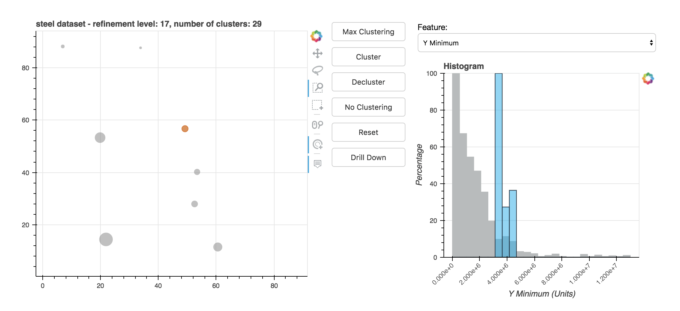
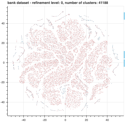
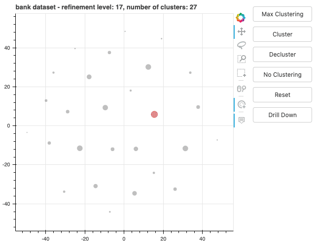
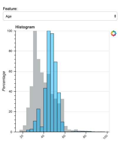
The demo of BiDViT can display selected data at various levels of refinement so that an analyst can choose the one that is most useful. For example, the plots below show data from a direct marketing campaign of a Portuguese banking institution. The marketing campaign was conducted via phone call. Each data point represents a customer, with the colour signifying whether the customer signed up for the advertised product (red indicates a lower subscription rate and blue a higher subscription rate). In the first figure, all data points are visualized. The second figure shows the data after 17 levels of coarsening. The third figure shows a histogram of the distribution of data in a selected cluster. With the insights gained from using BiDViT, a user may adjust parameters for each of the subclusters.
References
1 T. Jaschek, M. Bucyk, J. S. Oberoi, “A Quantum Annealing-Based Approach to Extreme Clustering”. In: K. Arai, S. Kapoor, R. Bhatia (eds.) Advances in Information and Communication. FICC 2020. Advances in Intelligent Systems and Computing, vol 1130. Sprinter, Cham. (2020).